
Yuvomi
Self-hosted family planner for tasks, calendar, shopping, meals, and budget
Alternative to: cozi, familywall, skylight
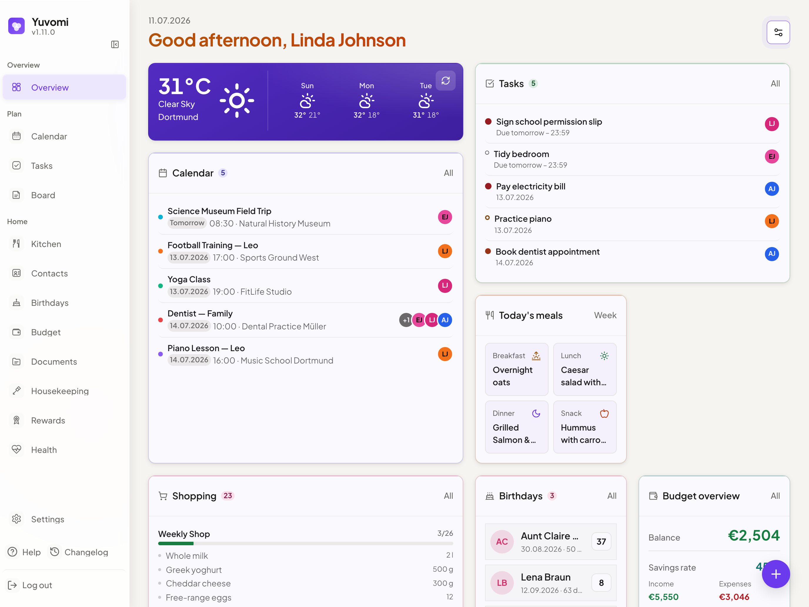
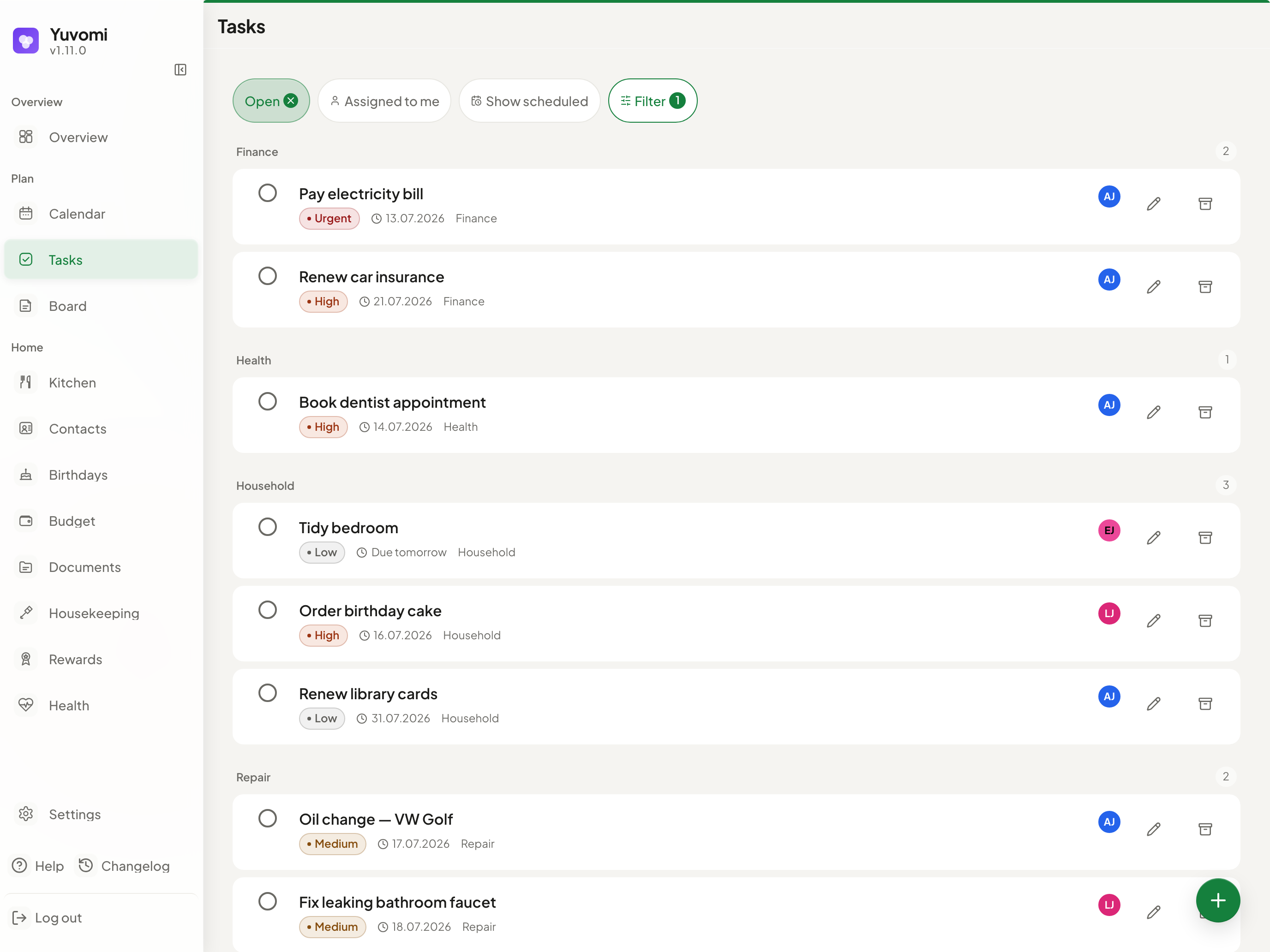
v2.70.0
2026-09-30Added
-
First-run setup keeps the chosen language. The setup page now tells the server which language it is shown in, so birthday events and other titles the server writes start out in that language instead of English.
POST /api/v1/auth/setupaccepts optionallanguageandtimezonefields for the same purpose; requests without them behave as before. -
The search opens places and actions, not only entries. Typing “Schedule” or “new” now offers a “Go to” section with every module in your navigation and every settings sheet, and a “Create new” section that opens the page and starts its add action, both above the entries found. The start tiles list every module you can open, including Schedule, Housekeeping, Rewards and Meals. The matched part of a word is highlighted, and an entry found in its description, note or location shows the passage that matched.
-
Inventory categories have their own address. Opening a category changes the address to
/inventory?category=..., so the back gesture returns to the category list and a link or reload lands in the same category. The head shows ”‹ Inventory” and the category name. On a desktop the category list fills the page instead of leaving an empty “select an item” column beside it. -
A shopping item can be deleted from its dialog. Delete sits on the left of the item dialog’s footer, with the same undo as the swipe, so removing an item no longer needs a swipe gesture.
-
Search finds parts of words and looks in every module with content. “milch” now finds “Vollmilch”, with accents and ß/ss handled as before. Besides tasks, events, notes, contacts, shopping, health and waste, the search now covers recipes, the pantry, inventory, documents, birthdays and budget entries, with the same permissions as the module itself; a module switched off for the household stays out of the results. The start tiles show only the modules you can open, and on a phone the overview has a search button, so the search is one tap away.
-
The budget ledger can be searched across all months. A search field in the head of the transactions list finds entries by title in every month, shows the full date for hits from other months and says how many it found. On a phone it is a search icon until you tap it, so the list does not move down. Shared amounts are searched in the title you are allowed to see.
-
“Due by today” as a task filter and an address.
/tasks?due=todaylists the open and started tasks due today or earlier, overdue included, and the filter sheet has a switch for it. The “+N more today” link on the overview now opens exactly that list. -
Vital readings and lab values can be edited. The edit button on a recent reading in Health opens it with its values, time, visibility and note filled in, where the row used to offer only delete; delete moved to the left of the dialog footer with the usual undo. In a lab report each value has an edit button that corrects the value and recalculates its flag. The API gains
PATCH /api/v1/health/results/:idfor a single lab value. -
The month on a phone shows the day you pick below the grid. Tapping a day in the month view now selects it instead of jumping to the day view, and its events and tasks appear as a list under the grid, in the same rows as the agenda; the date above the list opens the day view. Drag the list up or scroll it and the grid shrinks to the selected week, drag down to bring the month back, or use the button next to the date. A free day offers to add an event for that day, and ”+” adds to the selected day. Tasks and events are now told apart by shape (square and round) instead of a ring that was hard to see in dark mode, and the “Event titles” switch moved from the filter sheet to the month itself. Collapsed to the selected week, a swipe or the arrows move one week instead of a month, as in Apple Calendar, and the month follows when the selection crosses into the next one. With event titles on, the weeks share a fixed height, so the list below keeps the same room in every month; a cell that runs out of space shows “+2”.
-
Swipe between months, weeks and days in the calendar. On a touch screen a horizontal swipe over the month, week or day view moves to the next or previous period, with the same distance and vibration as the swipe actions in lists. Vertical scrolling, the hour grid and the system’s back gesture at the screen edge keep working; with reduced motion the new period appears without sliding in. The arrow buttons stay for mouse and keyboard.
-
The calendar can be driven from the keyboard. In the calendar,
tjumps to today,kandj(or the arrow keys when nothing is focused) move to the previous and next period, andm,w,dandaswitch to month, week, day and agenda - the keys Google Calendar uses. The help dialog (?) lists them while you are in the calendar. The month grid is now a single tab stop: the arrow keys move through the days and across into the next month, Home and End go to the start and end of the week, Page Up and Page Down move a month, and Enter opens the day (on a phone it selects it for the list below). -
The calendar tile shows the week ahead at 2x1. Set to the wide size, the calendar tile on the overview no longer lists three events but shows the next seven days: a dot per event in the colour of the event, person or calendar, a band for all-day and multi-day events (with an open end where they continue), and today highlighted. Tapping a day opens that day in the calendar. “Only mine” and hidden birthdays apply as in the list; the other sizes keep the list.
-
An “Expiring soon” tile for the pantry (#1448). An optional tile shows the pantry batches whose best-before date has passed or falls within the next 7 days: expired first, with quantity, storage place and the days left in words. Each row opens the pantry with the matching filter. The tile is hidden by default, can be shown from the customize tray, and can be restricted per member like every tile.
-
The overview shows what is still open in shared expenses (#1445). A new tile in the metrics row, right after the budget, shows your net balance and the largest open position (“You owe Alex”, plus “+N” for the rest), in the currency’s own decimal places. It appears only while something is open, respects budget access, and opens the settle-up view of that group. It uses the module’s own balance source, so it shows what the module shows.
-
Documents show a preview of the file itself. Images and PDFs stored in Yuvomi appear in the grid as a picture of their first page, anchored at the top; other files and documents from Paperless or a cloud keep their icon. The preview is drawn in the browser when a card scrolls into view, kept only in the page’s memory and gone when you leave the page.
-
A document can be edited from the viewer. A pencil button next to Share and Download closes the viewer and opens the edit dialog. It only appears for people who may change documents.
-
A recipe goes into the meal plan with a tap or the keyboard. Each recipe in the side column of the week plan is a button: a tap, a click or Enter opens “Add meal” with the recipe and its ingredients filled in, on today or the next free day of the visible week, and the meal chosen by the time of day. Dragging still works. Typing a meal name now also suggests your saved recipes, marked “Recipe”, before earlier meals; picking one fills in its ingredients and links the recipe. The suggestions can be read and chosen with a screen reader and the arrow keys, and Enter picks a suggestion without saving the dialog.
Changed
-
The demo data shows an ordinary family day on any date. Three tasks for Linda, Alex and Leo are due today, today brings an all-day sports day and an evening movie night, and the weekly classes start in the first week of the month, so the overview no longer says “Nothing else today” beside “No tasks assigned for today” and the month view is filled from the 1st. Six single events are spread across the whole current month, never on today, so the month is not empty before today either. Every meal of today is planned, and this week’s Friday pizza exists before the meal plan is opened. Height and head circumference have a value, so no vitals card reads “No value yet”. Only a database filled by
scripts/seed-demo.jsis affected. The screenshot script pins the browser clock to the evening, so the overview shows dinner, can write to another folder and capture single motifs, and adds a wall-mode shot. -
The website speaks to the whole family, and its module list follows the app’s menu. A new section shows three moments from the family’s side - the tablet on the kitchen wall, the app on every phone and an invite with the right access for each role - drawn with the three circles of the logo instead of a mock screenshot. The module section is grouped like the app’s navigation (Plan, Household, People, Finance, plus what lives in Settings) instead of one long row of cards, and the handoffs show the item travelling from one module to the next once as they scroll in. The hero no longer tilts, the grain overlay is gone, the first gallery screen is the meal week instead of a repeat of the hero, and the page ends on the family call to action rather than on the key warning, which stays in full on the install page.
-
The website wears the app’s colours and buttons. Module colours follow the app’s areas of life (kitchen orange for meals, recipes, shopping and pantry; one green for tasks, housekeeping and rewards), dark mode uses the app’s warmer card and border tones, and every button is a flat capsule like in the app instead of a lifted, glowing rectangle. The copy button on the install page no longer shows white text on bright green in dark mode, and the legal pages keep their header on one line on a phone.
-
The website says less and promises only what the app does. “What it replaces” is a short band of six pairs instead of a ten-row table, the module catalog shows names first and puts the descriptions behind “Show descriptions” on every screen size, and contacts sit under People as in the app’s menu. The pantry handoff no longer claims the last jar is “already” on the list (one tap puts it there, and reminders are about best-before dates only), points are described as going to whoever did the task, and a fourth question before you commit answers how safe access from outside is: two-factor sign-in that an admin can require, invite links, SSO-only login and signing out other devices. The same two sentences are corrected in the README. The page is about 1,350px shorter on a desktop and 800px shorter on a phone.
-
The web installer looks and works like the app. A step list on the desktop jumps back to finished steps and stays with you while Yuvomi starts, on/off options are switches as in the app, a phone shows more of each step, and the review groups your answers with a “Change” link each. The language you set up in carries over to the app, the upload limit can be set, and the “Active modules” link on the last page no longer opens the budget.
-
New events in the calendar’s week and day come from a double-click or a long press, not a click. A single click or tap on empty time now only closes what is open, such as an event’s popover, so clicking beside an event to put it away no longer opens “New event”. With a mouse, double-click an empty time; on a touch screen, touch and hold it for half a second - a placeholder with the coming start time fades in under your finger, and the form opens with that time when you lift it. Moving or scrolling cancels. ”+ Event” and the
nkey add as before, and an empty day names the gesture that works on your device. The month view is unchanged. -
The kitchen’s tools row folds away while you scroll on a phone. In recipes and the pantry the row with search and tools slides out of the way once the head docks and comes back when you scroll up again or move focus into it, leaving about 64px more for the list. Meals and shopping keep their row, because it names the week or the list you are in.
-
The calendar’s head buttons share one shape, and the filter shows its count. Search, filter and “More” are the same icon buttons with a 48px target on a phone, and the filter button carries the number of active filters like the filter buttons elsewhere; screen readers hear “2 filters active”.
-
On a phone the overview starts with what is due today. Two or more overdue items collapse into one line (“5 overdue”) with the avatars of the people involved, and a tap opens the list. Widgets show fewer rows on a phone and their titles stay on one line. Customizing on a phone is a compact list of names with a handle and an eye, with the hidden tiles at the top; on a desktop new items start from a ”+ New” pill in the head instead of a floating button.
-
Subscriptions, loans and split start with one glance line on a phone. The wall of figures above the list is one line that opens the details on tap, as on the budget overview, so the first entry moves up by about a third of the screen. Loans lose the summary line that repeated the remaining debt, and the budget head keeps its height when you switch tabs.
-
Every budget list is operated the same way. A row opens its sheet, and delete lives in the sheet footer for transactions, loans and subscriptions; the one action that moves money on (book, pay instalment, renew) stays on the row. The subscription search sits in the head of the list, and the statistics show each category once, with the bars in the colour of their slice of the donut and its share next to them.
-
Health on a phone puts today before the list of areas. The person switcher moves into the head bar as a pill, and “Due today” and “Quick add” come before “All categories”. On a desktop the detail column has a head with the area’s seal and name, and the add button names its object (“New checkup”, “New workout”, “New meal”) instead of “New entry”. Empty checkup and nutrition lists show one empty state with an add button.
-
Fasting shows one empty state until the first fast. Statistics appear once a fast is recorded instead of nine zeros and seven empty days. Goal, clock and reminders moved from the middle of the page into a settings sheet behind the gear in the timer card; the goal is a segmented control. History rows carry named edit and delete buttons, and the date range uses the app’s date picker and applies as soon as a date changes, without the time zone sentence.
-
Waste collection starts with one block until the first waste type. Tapping a template (paper, residual waste and so on) creates the type directly, and a calendar file can be imported from the same place; the add button says “Waste type” until then. Without shift types the shift plan shows one way forward, “Go to shift types”, instead of three empty sections.
-
New colours come from one palette that reads in both themes. Shift presets, new waste types and new housekeeping helpers start from ten tones that keep 3:1 contrast on light and dark surfaces and stay clear of the app’s violet; a new helper starts in cyan. Colour swatches get an edge in dark mode. Colours you already chose stay as they are.
-
Your shift plan settings moved to Settings. Reminder lead time, overtime tracking and weekly hours are in “My settings” of the shift plan sheet, open to every member, instead of a card in the evaluation tab; the evaluation shows the total hours once as a tile. The comparison fits a week of one person into the desktop width.
-
Housekeeping has one name and uses a wide screen. Labels say “Housekeeping” throughout, the first tab is “Overview” with “Due” and “Done this month”, and on a wide screen visits and payments stand side by side. Rewards on a phone show one row per person with the points in a capsule.
-
The kitchen head on a phone follows one rule. The tab bar carries the tabs with their counts, and the tools of recipes and pantry sit in a context row of their own. The shopping list has one plus at the input and a return key to add, swiped rows lose the detail chevron, and rows glide to their new place when the list redraws. The pantry side rail shows only items with a deadline.
-
Recipe and meal dialogs are easier to fill in. Meal types are toggle chips instead of checkboxes with colour badges, an ingredient row gives the name its own line so the category is no longer cut off, “Add ingredient” and delete look the same in both dialogs, and adding a meal from an empty slot asks for the name first. A recipe’s details open and close with motion.
-
The task detail footer is one row on a phone. Start and archive moved into the “More” menu, and the assignee picker no longer sits beside every open row.
-
Family members and invites are added in a dialog. “Add member” and “Invite” open a sheet with Cancel and the primary button in the footer instead of a form that appeared further down the page, and focus returns to the button afterwards. The permission mode switch is the same segmented control as elsewhere in Settings.
-
Calendar feeds are switches in the sheet of their module. Shift plan, cycle, inventory and waste feeds each have a switch in their module’s sheet (inventory and waste have a sheet of their own now) instead of five primary buttons in one place. Module sheets follow the order of the sidebar, on a phone every settings sheet opens with a large title, and switching sheets fades the new one in. Several hints were rewritten to match where things are now.
-
Menus grow from the control that opens them. Pop-up menus scale in from their button and only fade with reduced motion; budget tabs, health areas and calendar views fade in when you switch. On a desktop the calendar filters open as a popover at their button instead of a sheet.
-
Search and the desktop head are tidier. The command palette offers help, keyboard shortcuts and “What’s new” (formerly “Changes”), and has a single clear button. The version number left the sidebar and is shown in “What’s new” and in the system settings. Buttons and search in a desktop head share one height.
-
Date fields speak your language. The expiry date of a document, the checkup dates and the fasting range use the app’s date picker, and typed dates show their placeholder in the interface language (“TT.MM.JJJJ” in German) in the order of your date format.
-
Subtasks are added in a line of their own. “Add subtask” opens a field in place in the task view, the detail column and the sheet on a phone. Enter adds the subtask and leaves the cursor in the field for the next one, Escape closes it; there is no dialog in between any more. The task dialog shows priority and category next to each other in the main part, and “More settings” says what it holds (start date, points, tags, status, visibility and documents).
-
Customizing the overview no longer loses changes silently. Leaving customize mode through the sidebar, the tab bar, the search or the back gesture asks the same question as “Cancel” when something was changed. The add button is hidden while you customize.
-
Toasts wait while you read them. A message stays as long as the pointer or keyboard focus is on it and then keeps at least two seconds, so “Undo” no longer disappears under the cursor. After many confirmations only the visible message is left out; screen readers still hear every one.
-
The permission matrix shows the chosen level at a glance. The selected segment has a tinted surface with an accent edge in light and dark mode. On a phone the save bar only sticks to the bottom once something was changed.
-
Dose buttons name the medication. Screen readers hear “Take Vitamin D3” and “Skip Vitamin D3” instead of a list of identical buttons, and on a phone the take button is a small capsule with its word rather than a check circle that read as already done.
-
Loans stand on a surface. Loan cards in the budget use the same surface as the other cards, their transactions sit in a grouped list, and hovering a card no longer shifts it.
-
The meal plan week is calmer on a desktop. The week starts at the top, day heads are one line (“Mon 28.09.”), and empty slots are quiet wells whose edge only appears on hover, focus or while dragging.
-
Kanban column heads line up. All column heads have the same height; the archive action in the “Done” column is a row action like elsewhere.
-
Due labels and short texts use a middle dot instead of a dash (“Overdue · 24.09.”).
-
A new contact starts in the category you are looking at. It no longer defaults to “Doctor”: with a category filter active that category is preselected, otherwise “Other”.
-
Expenses in the budget are no longer red. Amounts read in the text colour with their sign, category bars use the budget’s own tone, the trend line a neutral grey, and income may stay green. Red is left for what needs attention: an account in the minus, a negative balance or a plan that is over its limit.
-
Success messages are calm. A confirmation sits on the same glass as every message, with a green check mark instead of a full green bar. Errors and warnings stay prominent.
-
Long words break at a syllable with a hyphen. Recipe names, meal types, health labels and overview labels no longer split mid-word (“Tomatensupp / e”); they break as “Tomaten- / suppe”.
-
Plain words where the app was literal-minded. The tile size that makes a tile two columns wide is called “Wide (2x1)” instead of “Narrow”. Pantry units follow the amount (“6 cans”, “1 bottle”, with proper plural forms in every language). “As needed (PRN)” lost its abbreviation. In the shift schedule “Start date” is “Cycle starts on”, every create button says “Add”, and “Valid from” and “Valid until” moved behind “More settings”, open when a date is set.
-
A recipe shows its sections as headings and asks once about the pantry. “Ingredients” and “Notes” are real headings. Instead of “Not assigned” under every ingredient, one button below the list assigns the open ingredients to pantry items in a single dialog.
-
Charts use round axis values and a real time axis. Health vitals, lab results, activity, cycle trends, the budget trend and the odometer chart label their axis with round steps (0, 20, 40 …) and place points by date, so uneven gaps look uneven. Vitals span the whole chosen period.
-
Cycle calendar and trends sit side by side on wide screens. Where the health detail column is wide enough (about 1920px screens), the trends stand next to the calendar with charts at least 160px tall; below that they stay underneath, with taller charts than before.
-
The shift schedule’s statistics open on the numbers. Period, then the figures, then your settings; each tab has one primary button, and holidays and plan blocks show a colour dot instead of a coloured stripe.
-
A docked header over a full-width tab bar keeps its title in the shift schedule, household help and rewards, so a phone never shows a header without saying where you are.
-
Selecting documents works like selecting tasks. Move, delete and done sit in the shared pill at the bottom, delete asks in the pill and can be undone for five seconds, and “Select all” and archive are in the tools menu while selecting. Folder names in the side list fit on one line.
-
Shopping columns on a desktop pack short categories without empty space below them, also in browsers without masonry layout.
-
Tapping a household help task opens it for editing, as with birthdays; the edit and delete icons stay visible. Members who can only read see the task without an edit promise.
-
Reduced motion keeps the gentle fades. With reduced motion switched on, sheets and the search no longer slide or scale, but still fade in, so a change of view is not an abrupt cut.
-
Settings have one sheet per module, and a list beside the sheet on a desktop. Settings are grouped into Account, Household (admins) and Modules. Every module has one sheet, as in Apple’s “Settings > App”: a line at the top says whether the module is on (it is switched on and off only under Active modules), followed by what you set “For me” and, for admins, “For the household”. Calendar sync, calendar and feed subscriptions and event defaults are on the Calendar sheet, contact sync on Contacts, reminder sync on Tasks, the cycle options on Health, document storage and DMS on Documents; Immich and the household weather source are under Household - Integrations. “Module options” and the Sync area are gone. On a desktop the areas and sheets stand as a list on the left with the search at its edge and the open sheet on the right in a readable width, with the first sheet already open; on a phone you still tap in and go back. Old settings addresses and bookmarks still work: they lead to the matching sheet and section, and the search still finds every option and every former page name.
-
Health opens on an overview that is also its navigation. The row of nine tabs is gone. The overview lists all areas with their latest value or status, as in Apple Health - on a phone above the summary, on a desktop as a list on the left next to the summary or the chosen area. Each area has its own address (
/health/vitalsand so on, old?tab=links still work); on a phone an area slides in with ”< Health” and its name as the title, and going back returns to where you were on the overview. The person pill, adding with “n” and editing readings work as before. The cycle fills its column on a desktop: calendar and legend side by side, statistics without gaps, the month arrows next to the month name, and the fertile window and the tip mentioned once each. -
Shopping and the pantry use the width of a desktop. From a main column of about 960px the shopping list shows its categories in two columns, and the pantry keeps a side panel with what is expired, expiring soon or running low next to the list; tapping an entry there opens it. All four kitchen tabs now end at the same edge.
-
Smaller desktop tidy-ups. The rewards ledger and lists keep a readable width while the catalog grid may use the full width, and its header button lines up with the grid. On the overview, a tile next to a gap grows into the rest of its row, so rows have no holes (nothing is saved; the customize mode still shows the chosen sizes). Contact filters show only categories that are in use and wrap on a desktop instead of scrolling sideways. Household help shows one visit row everywhere (date first, then person, amount and payment), marks due and overdue tasks by the word instead of tinting the row, keeps its figures in one row on a phone and puts the chart below the list. The budget plan has one add button (in the header), the history of a shared expense names the expense and its amount, and the “Active groups” figure no longer takes a full row on a phone.
-
On wide screens, contacts, tasks, recipes, inventory, birthdays and the calendar agenda show the selected entry next to the list. From a main column of about 1040px (1280px laptops with the sidebar open and everything wider) the list stays on the left and the entry you pick opens on the right, with its own title and actions, and scrolls on its own - as in Apple Mail. Without a selection the first entry is shown, so the right half is never empty; on a phone nothing is picked for you. The actions at the foot of the entry stay in view in one row while you scroll, and “Open in Maps” sits in the location row. Inventory shows the details grouped (purchase, warranty, condition and records) at full height, and its figures as rows above the list. The arrow keys move the selection, Enter edits, Escape goes back to the list, and the back button returns to the previous entry. Every selection has an address (
?open=<id>), the same one global search and the meal cards already used, so a link opens the entry beside the list on a desktop and as before on a phone. Contacts get a card at the top of the column with call, email and map shortcuts. Below that width and on phones nothing changes. On very wide screens the two columns line up with the page header instead of running to the window edges. -
The sidebar fits every module at 1280x800 and 1440x900 without scrolling. The collapse button and search sit in the logo row (search now also opens with Cmd+K or Ctrl+K), rows and section labels are more compact, and Help, Changelog and Sign out moved into a menu behind your avatar at the bottom, with a dot on the avatar when an update is waiting.
-
Budget statistics use the width of the budget lane. From about 960px the expense shares sit beside the trend and category charts, on the same columns as the overview, instead of below them.
-
Household help keeps the reading width of the other lists instead of a wider measure of its own, and the shopping and household help headers are back to the height of their neighbours on the desktop.
-
Budget puts the bookings first and speaks one language across its seven tabs. A pass over the whole module from the 2026-09-25 critique; the tabs themselves stay as they are.
Wide screens: the overview shows the bookings on the left and the month summary with the categories on the right, where they stay in view while you scroll (as long as they fit the window). The list no longer scrolls inside a small box of its own: at 1440x900 you see 11 bookings instead of 3, at 1280x800 9 instead of 1, and the page has one scroll bar instead of two. All seven tabs start and end at the same edges - the plan is no longer centred - and every section title has the same size. “Expenses only” sits in the heading of the month summary with a larger target.
Phones: on a 390x844 phone two bookings are visible straight away instead of none. The balance leads the month summary (on a phone as one row with income and expenses inline, see “Budget on a phone starts with the bookings”). Wherever the overview has a single column (phones, and laptops with the sidebar open) the category chart shows the three largest expenses, with “All categories” in its heading to expand it. “Manage categories”, the CSV export and grouping by person are one menu next to “Transactions”. When you scroll, the “Budget” title folds away like the calendar’s and the header shrinks from 162 to 117px.
Subscriptions: the four filter drop-downs became one “Filters” button with the number of active filters; it opens a sheet, and each active filter shows as a removable chip below the search. Sorting and the two management dialogs are in one menu. The list comes before the charts and its rows are compact - on a phone 74 to 109px instead of 173px, with the due date wrapping between date and “2 days overdue” instead of running under the amount. “By category” is a bar list with amount and share instead of a pie chart without values, the renewal forecast names its peak month, and the charts no longer overflow on a 1024px screen. “Over budget” offers “Most expensive first” and speaks like the plan: amber from 85 %, red once the budget is exceeded. The yearly projection no longer repeats the currency, and “1 day overdue” is singular.
Split: the tab no longer repeats a second title and description, “Add expense” is the button in the budget header (on a phone the usual ”+”), so no floating button covers amounts on a desktop, and group actions besides “Settle” are in one menu. At 1024px the groups sit above the group instead of beside a column twice the screen height.
Charts and figures: the category chart has one scale for income and one for expenses, so the salary no longer squeezes every expense into a sliver. A month that has not started yet is labelled “Month forecast” and its balance is no longer green, and bookings dated after today get a ring instead of a dot. Income and expense totals are shown in the text colour - colour stays with the balance and the change against last month. Amounts on all budget tabs use digits of equal width. Statistics no longer repeat the overview: the trend adds up over the month, the categories show the change against the previous week, month or year, and the whole chart can be scrubbed instead of hitting a 10-24px column.
Dialogs and details: the booking dialog starts on a large amount field, asks for amount, title, category and date, keeps account, visibility, people, repetition and receipts behind “More details” (open when editing a booking that uses them), and is as wide as the other forms. Delete buttons name the booking they delete, the whole title line opens a booking, ”+ Category” has a full-size target, and an empty month shows one sentence and its button instead of three sentences and three zeros. Each loan offers “Mark as paid” as a secondary button, leaving one primary button on the tab. The accounts tab says “All accounts, as of today”, and new accounts are added with the ”+” in the header like on every other tab - the “Add account” button only appears while there are no accounts yet.
-
The calendar gives phones more room for events. The calendar header on a phone is shorter (see “The calendar header on a phone takes two rows”), and when you scroll the week, day or agenda, the page title folds away completely and leaves only the date navigation. The month and the week show more of their grid than before. The week’s day headings sit in one line with the date and the hour column is narrower. The period label keeps its width, so the arrows no longer jump when you switch views, and on wide screens they sit next to the label instead of at the far ends of the header.
-
The month grid has only as many rows as the month needs. It used to show six weeks every time, so a month like September 2026 ended with a full row of October; it now shows four to six.
-
An event looks the same in every calendar view, and every time reads “17:00 - 18:30”. The month showed a tinted bar with a coloured edge, the week a block with an extra frame and a generic calendar icon, the day a card with two colour strokes and its title floating in the middle, the agenda a white row with a coloured dot. Now all of them follow the month: tinted surface, one coloured edge, the title at the top and the time underneath when there is room; agenda rows and the day list under the phone month carry the same edge instead of the dot. An event shows its icon only when you picked one, in every view, and the repeat mark on every series. Icons take the colour of the title instead of the raw event colour, which was hard to read on light colours such as amber. Times use one format everywhere, with “Uhr” once at the end in German instead of after each time, and shift times now follow the 12-hour setting. The “ganztg.” label next to the all-day row is now the full word and wraps in the narrow phone column instead of running into the screen edge, tasks in the agenda sit closer together and line up with the date and the event rows, and the initials in the agenda’s avatar stack are 12px.
-
A trip over several days is one bar in the calendar, not a chip on every day. In the week’s all-day row and in the month on a computer, an event that spans several days is now drawn as a single bar across its days, with its title, icon and people once, as the calendar tile on the overview already did. Where it runs on past the end of the week, the bar stays open with a small arrow, and it picks up with the same arrow at the start of the next week. Overlapping trips stack in rows without covering each other, above the events of a single day, and “+2 more” in the month counts the bars it had to hide. Over days of the previous or next month the bar is paler, like the events there. An event over 24 hours shows “from 14:00” at its start and “until 11:00” at its end. The agenda and the day list under the phone month keep one row per day but say which day it is (“Day 2 of 3”). Screen readers hear a bar as one event with its dates (“13 to 15 October”) and a continued piece as “continued”, and a month day that names three of four entries now adds “and 1 more”.
-
The calendar’s arrows say where they go. They are named “Previous month”, “Next week”, “Next 3 days” or “Next 30 days”, depending on the view, instead of “Back” and “Forward”, and show that name as a tooltip. The agenda’s heading names the span it lists (“24.09. - 24.10.2026”) instead of only its first day, so it is clear that “Forward” moves thirty days.
-
The event dialog asks the common things first. Title, time, people, recurrence, reminders, location and description now come first; visibility, the countdown switch, colour, icon, sync target and attachment moved behind “More settings”, which now names what it holds. Start and end each take one row with date and time side by side, so the dialog on a phone is about a third shorter. When you edit an event with a restricted visibility, a countdown or an attachment, the section opens by itself. “Add reminder” is a compact button under the reminders instead of a bar across the whole dialog. The “Nobody” choice in every people picker is now a plain chip instead of a grey placeholder avatar with dashes around the word.
-
Edit sits at the bottom of an event on a phone, Delete no longer does. The sheet that opens for an event put Edit at the top, out of reach of the thumb, and Delete at the bottom, where the thumb rests. Edit is now the main button at the bottom right; Delete stays in red at the start of the row and still asks before it deletes.
-
“Clear all filters” is always in view. It sat at the end of the calendar’s filter sheet, below the fold on a laptop screen, and now sits at the sheet’s bottom edge.
-
Rewards on the dashboard show progress, not a ranking. A child sees only their own balance, a quiet bar to the next reward, recently earned points and their own pending requests - no siblings, no places. Parents see every child side by side, ordered by name. The metric tile no longer names a leader. The number of pending approvals now appears in exactly one place: in the rewards widget, otherwise in the today sheet, and only without either in the parents’ metric tile.
-
The today sheet uses wide screens: from a sheet width of 720px its rows run in two columns.
-
Dates on the overview read like people say them: a weekday up to six days ahead, then day and month, and the year only when it differs.
-
Metric tiles say what they count (“2 left”, “9 this month”, “Here since 08:30”), and the widget titles are shortened to “Budget” and “Family”.
-
A calmer dashboard header on phones. The date line carries the buttons and the greeting stays on one line; at 200 % zoom the header shrinks to its date line. The “updated at” time appears only on the wall display.
-
The dashboard grid always packs without gaps, with a custom order and while editing, so cards no longer jump. If a gap remains, edit mode suggests a card size that closes it.
-
The tall budget card lists the three largest expense categories.
-
The wall display reads better from a distance: larger section titles, and larger rows on a quiet day.
-
Documents have one menu for sorting and selecting. Sort order, direction and “Select several” moved into one button in the header, Active and Archive became a segmented control, and upload has one path: the drop zone, with “or choose a folder” underneath and one size hint.
-
“Deadlines” leads the document filters. The chip for documents that expire soon or have already expired now stands first, before the categories, and is named for both. It still only appears while something is due.
-
Document cards and rows are calmer. Cards follow the card style of the other modules, with the description only when there is one and the details on one line. The expiry date comes first in a row and on a card, with a short form where the card is narrow. Storage labels are neutral with an icon per place, the visibility is named only when it is not “Entire family”, a folder chip no longer shows inside the folder it names, and a folder named like its category’s plural is not repeated. On a phone, grid titles are a size smaller and may take three lines.
-
On a phone a document row opens with a tap, without the eye button. “View” is the first entry in the row’s menu instead; the grid and wide lists keep the button.
-
The new document dialog shows the expiry date right away, next to its reminder, which appears once a date is set, and has a Cancel button.
-
Bulk actions without a selection step back instead of warning. Archive, in the tools menu while selecting, stays dimmed until a document is picked.
-
A search that finds nothing offers the other view. When the archive holds matches for a search among active documents, or the other way round, the empty result offers to search there.
-
A view without documents leaves out the filters, so an empty archive shows only its message.
-
On a phone the content runs under the glass tab bar. The tab bar now floats over the list instead of taking its own strip at the bottom, so every module shows about 70px more content, and the glass shows what scrolls beneath it. At the end of a list there is enough room for the last row to stop above the bar; focused fields and toasts stay clear of it as before. Desktop is unchanged.
-
Module headers on a phone have at most two rows. The first row holds the title, search as a magnifier that opens into a field, and one ”…” menu; the second, where there is one, holds the view switch, the period, the tabs or a “Filter” button with the number of active filters. Managing categories, tags and storage locations, selecting several items, importing and the history view moved from loose buttons into that menu in Tasks, Notes, Inventory, Contacts, Pantry and the meal plan. The Tasks header shrank from three rows to two, so the first task starts about 120px higher; the Inventory header lost its extra row.
-
Tasks keep their filters in a sheet. “Filter” opens a sheet with recently used sets, “Assigned to me” and “Show scheduled”, grouping, status, priority, person, category and tag; a change applies at once and the number on the button shows how many are active.
-
Filter chips scroll away with the list in Notes, Contacts and the pantry instead of standing fixed above it, where they took about 65px on every screen.
-
The four kitchen tabs share one header. Below the kitchen tabs every tab has the same row: the week in the meal plan, the lists in Shopping, then search and one ”…” menu, all four the same height. “Randomize plan” and “Show recipes” moved into the meal plan’s menu. On a desktop Shopping now has its “Item” button in the header like the other tabs.
-
Housekeeping shows the task list first. Adding a task, with the templates as quick picks above the form, sits behind the add button, and templates that already exist as a task are not offered again. Tasks and visits use the list rows of the other modules, so on a phone the list starts at the top of the screen instead of below the templates, and the report month sits in the header like in Budget.
-
Settings on a phone are one list. All settings appear grouped by area on the first screen instead of behind an extra level, with search in the header; inside a setting the way back stays at the top while you scroll. Links to an area open the list at that area.
-
Changing pages keeps the navigation still. The content cross-fades while the sidebar, the tab bar on a phone, the header toolbar and the kitchen tabs stay where they are, and the old page stays in view until the new one is ready, so there is no empty frame in between. Browsers without view transitions get a plain fade instead of the sliding, springy entrance. Tapping during the fade ends it at once, so the next tap already reaches the new page.
-
The kitchen tabs stay put when you switch between them. The highlight slides to the tab you tapped, and the counts show at once in the room kept for them.
-
Lists fade in once, when they first appear, instead of again after every search, filter or update.
-
A checked-off task leaves the list gently. When it no longer belongs in the current view, it stays checked for a moment, then folds away and the rows below move up; Undo folds it back in. Collapsing a group in Tasks or a category in Shopping folds the rows instead of making them jump.
-
Finishing a housekeeping task answers like checking off a task, with a short vibration and the check mark at the tap.
-
Tiles glide to their new place while you customize the overview, when you move or resize them, and the grid shows a dashed edge instead of a violet tint.
-
The fasting ring is easier to read. Its track is thicker with round ends and moves smoothly as time passes instead of being redrawn; before the first fast the clock shows no zeros, no day and no switch.
-
Buttons speak one language across the app. Edit, delete and more-actions on a row are the same round icon button in every module (Budget alone had four styles), and a screen reader hears what they act on: “Call Anna Weber”, “Delete category Fruit”, “Add a meal on Monday” instead of twelve rows all called “Call”. Every search field is the same filled capsule with a clear button - subscriptions, shared expenses, the document and icon pickers, the settings sidebar and the field inside the calendar’s search bar included. Lists sit on one carrier. Dialog buttons live in the footer at the edge of the sheet, so “Create” in the shift plan and “Save” elsewhere are no longer below the fold on a phone; Delete is a text button on the left, and Cancel always looks like the safe way out. In Health and Rewards the add button names what it adds on each tab and docks in the header on a desktop. A note opens with Edit as its main action instead of Delete alone, and the birthday import moved into the tools menu. The dashed “Add subtask” buttons in a task are capsules like every other button.
-
Settings use switches and find single options. Every on/off setting is a switch with the label on the left, theme and week start are a segmented control, and the module list only marks what differs (off, failing, not in the menu) instead of fourteen green “Enabled” badges. The settings search finds individual options, not only pages, and jumps to the option and highlights it. The calendar sync page now says what it connects: Google, Apple, Outlook and CalDAV.
-
Sheets on a phone have a grabber you can see and follow your finger. The handle at the top of a dialog sheet is now visible in light mode too and sits right above the title instead of in an empty strip. Dragging moves the sheet exactly with your finger; a short flick down or a pull of about 80px closes it, anything less springs back smoothly, and pulling up gives a little. The “More” sheet of the tab bar works the same way, with the same grabber, glass and corners, and no longer dims the tab bar it came from. With reduced motion the sheet does not spring.
-
The add button is the same everywhere and says what it adds. On a desktop, Tasks, Notes, Contacts, Calendar and Budget now show the same labelled add button in the header as the other modules, with the
nshortcut announced. In the calendar it now appears in the header at all instead of floating over the month. Budget names the thing on every tab (Entry, Budget, Account, Subscription, Loan, Expense), the shift plan says “Shift type” instead of a sentence, and in the kitchen the button stands at the same place on all four tabs, so it no longer jumps when you switch between them. -
Search sits in one place with one width. On a desktop every module header shows its search right after the title at the same width, instead of nine different widths on the left or right.
-
Selecting tasks works like selecting elsewhere. In select mode a selection circle takes the place of the status circle and the assignee, and the actions (done or open, delete, finish) sit in the floating bar that Shopping, Contacts and the pantry use. Each row is named after its task for screen readers, deleting asks with the number of tasks and can be undone, and archiving or tagging the selection is in the tools menu. While selecting, a swipe does nothing and subtasks show their state without their own buttons, so a tap cannot complete or change something you meant to select.
-
Fasting speaks the language of the other health tabs. The person is picked with the same pill as on every health tab, reminders are switches, the settings keep a readable width on a desktop, and the info button next to a heading is announced as “Explanation: Your goal” instead of repeating the heading.
-
Actions on notes and in the meal plan are always visible. Pin, open and delete on a note card, and edit or add on a meal, no longer appear only when the pointer is over them; they stay in a quiet colour.
-
The highlight slides in every segmented control and tab bar. The moving highlight of the kitchen tabs now runs in Health, the shift plan, Budget, the calendar views, List and Kanban in Tasks, Documents, Notes, Housekeeping, Rewards and the settings, with one speed and curve; with reduced motion it jumps. The sidebar highlight is quicker, a collapsed sidebar waits a moment before it opens under the pointer, and the kitchen highlight stays on its tab after the sidebar is collapsed or expanded.
-
Contacts and documents select with the same circle as tasks. Select mode shows the round selection circle with the name of the contact or document instead of a browser checkbox, and the whole row still toggles it. The “Open” mark on a document from a connected document system is always visible instead of only under the pointer.
-
Meals and recipes delete from the dialog footer. Delete sits on the left of the footer with Cancel and Save on the right, as in the other dialogs. For a repeating meal the question which occurrences to delete appears over the dialog, and cancelling it keeps the dialog with your changes.
-
Default reward points save like the switches beside them. The field saves when you leave it or press Enter, checks the value in place and confirms with a message; the separate Save button is gone. Escape restores the saved value.
-
The permission matrix says which role you are editing. The first role is selected when the page opens, the role and member chips announce their state, and a legend on wider screens explains the access icons with their meaning for modules, widgets and further permissions. If the permissions of a role or member fail to load, the page says so and offers to try again instead of showing defaults that cannot be changed.
-
Task rows on a phone give the title the width. The “Who did it?” picker left the row: it sits next to Complete in the task’s detail and in the row’s context menu (long press or right-click). Titles use the row’s width, and the due date ends with an ellipsis instead of being cut off. The board shows one column per page on a phone - swipe between columns, the dots above show where you are, and cards are as compact as list rows.
-
The calendar header on a phone takes two rows. Month, week, day and agenda moved into the ”…” menu, as in Apple Calendar; filter, search and the menu share the first row, the arrows and the period the second. Event titles in the week wrap to as many lines as the block has room for instead of stopping after one.
-
Notes on a phone open with a tap on the card. The title reads larger than the text, and the cards are shorter, so about three and a half notes fit on a screen instead of two.
-
A contact on a phone opens with its card, with the monogram and the quick actions to call, write or show the address, as on a wide screen.
-
Vitals on a phone open a sheet. Tapping a tile opens the measurement with a tall chart across the full width, the period switch and the list of readings with edit. Metrics without a value share one “More measurements” row instead of a tile each.
-
Budget on a phone starts with the bookings. The balance is one row with income and expenses inline, the categories wait behind “All categories”, and the first booking is on the first screen instead of below it.
-
The meal plan on a phone is one list per day. Each meal is a row with a dot and the meal type in front of its name, the handle is small at the end of the row, and delete lives in the dialog footer. A week needs about a third less scrolling.
-
Customizing the overview on a phone keeps one bar. Cancel, the title and Done share one row, the note on who sees the layout moved below the tiles, “Today” folds to its header while you arrange, and each tile offers one size menu with only the sizes that change something there. The first tile now starts on the first screen.
-
The kitchen tabs fit a phone. The four tabs fit down to 375px without scrolling; the search and tools of Recipes and Pantry sit in the context row below them (see “The kitchen head on a phone follows one rule”).
-
The shift plan’s statistics period is a menu on narrow screens instead of a segmented control that scrolled sideways.
-
Delete sits at the start of every dialog footer. In every dialog with a delete button, Delete stands on the left and Cancel and Save on the right (mirrored in right-to-left languages), in the calendar, budget, contacts, health, inventory and pantry alike.
-
Messages stay dark in dark mode. Toasts and the selection pill used to turn light in dark mode and were the brightest thing on the page. They are now dark glass with light text in both themes, readable at 4.5:1 or more.
-
Holiday switches in the calendar settings save right away. “Show public holidays” and “Show school holidays” save when you flip them, like the other switches, and confirm with a message.
Fixed
-
“Due today” stays readable on the selected task. On a wide screen the task open on the right is highlighted in the list, and on that highlight “Due today” and “Overdue” fell below the 4.5:1 contrast the rest of the app keeps. Both now use the darker text shade there.
-
The website no longer states things the app does not do. The quick start said a database left on the placeholder key gets encrypted with a public value; Yuvomi does not start on the placeholders at all, and the note now says so. The install page promised a two-command Docker setup where the steps are a handful of commands plus one edit in
.env. The site and both READMEs named OpenAPI 3.0 while the server delivers 3.1 and called documents “tagged”, and “turn on what fits” stood over four modules that cannot be switched off. The outbound note now lists every service that connects once you switch it on, as the README does. -
The install page’s steps and fixes match the files they describe. A busy port is now moved with
OIKOS_HTTP_PORTin.envinstead of by editing the compose file, and the database reset removes the data folder, whichdocker compose down -vnever touched. Step 2 names theREPLACE_WITH_…placeholders and how to edit.env, a new first fix covers a container that keeps restarting on them, and the Docker path switches its commands to Podman. Portainer and Windows get a note each, and the last step shows the right address for Proxmox and the web installer. -
Every install path on the website runs to the end. The Proxmox steps installed a Debian package that does not exist in Debian 13 and created the container from a template that was never downloaded; they now fetch the current template with
pveamand installdocker-compose, and the Docker steps sit in the Proxmox tab itself, so the page ends on the container’s address instead oflocalhost. The web installer names the SSH tunnel for opening it from another device and points servers without a browser tobash install.sh. After choosing Podman, troubleshooting, restarts and updates show Podman commands too. Umbrel no longer reads as if it had asked for the keys it generates itself, TrueNAS calls the database key optional like its own form, and the encryption decision comes before the first start. On a phone the download commands wrap, so the file name is visible. -
The website loads less and keeps one header on every page. On a desktop the landing page no longer downloads a 414 KB English screenshot in PNG alongside the one it shows (about 180 KB of images instead of up to 590 KB); only visitors without JavaScript get the PNGs. No screenshot appears twice any more, the dot in “Why one app” travels along the arrow instead of across the first label, the expanded Household group has no gap between its entries, and at 320px the header fits the screen. The privacy notice, Datenschutz and Impressum use the same glass header as the other pages, with the logo in the same place on all five, and with “reduce transparency” or “increase contrast” switched on in the system the header turns solid, as in the app.
-
The website is easier to use on a phone and with a keyboard. The Install button at the bottom of the phone screen stays while you read and only steps aside over the command blocks and the closing buttons; it used to vanish on every downward scroll. The section menu no longer hangs off the left edge on a phone, fits its longest entry on one line and closes with Escape or when focus moves on. Links inside sentences are underlined and easier to tap, long captions and legal text wrap at a readable width, and the German page no longer shows English first and then jumps on a slow connection. The legal pages share the install page’s header and footer links. With JavaScript off, the home page no longer shows an empty box above the dashboard picture.
-
The website’s evidence links show what they claim. “0 trackers” now opens the README’s full list of outbound connections instead of the website’s own privacy policy, and the source link says it leads to the update check. The quick start names the image’s architectures, amd64 and arm64 including Raspberry Pi 4 and 5. Every page has a home-screen and PNG icon, search engines get a sitemap and a description of the app, the German page carries a German description, and on a phone no separator dot is left hanging at the end of the stats line. The English note on the imprint links the English privacy policy.
-
The weather settings show weather configured by the server. A location set during installation (
WEATHER_*, or the legacyOPENWEATHER_*) showed weather on the overview while the admin weather page said “Not configured”. The page now names that source, shows its location and units read-only, and says that a location saved here takes precedence and how to turn the server setting off. Removing a saved location now also removes its coordinates, so the server setting applies again, and the page says so.GET /api/v1/preferencesreports the source asweather_source, without any API key. -
Wall mode can be left on a phone (#1559). “Leave wall mode” was below the bottom edge on phones and showed only a grey icon until the screen was touched, and the back button closed the app instead of leaving wall mode, which was still on at the next start. The exit now stays at the bottom of the screen at every size and always shows its label, the back button or gesture leaves wall mode (also right after a restart in wall mode), and turning it on says in one line what it is and how to leave it.
-
A restore waits for pages that save something after asking another service (#1551). Some pages that only show data still save something once an answer comes back: a renewed Google token when the calendar list, the sync targets of the event dialog or a Google Drive document are loaded, the calendar list of an Outlook or CalDAV account when it is refreshed or loaded for the first time, and the exchange rates on the subscriptions page. A restore did not wait for them, so this could land in the restored database or fail on the closed one. A restore now waits for them, and while it runs these pages answer “try again” instead of starting. A new page that waits for another service now fails a test until it is covered or marked as only reading.
-
Deleting the first entry of a recurring budget payment says that it ends the series (#1544). The series hangs on its first entry, so “Only this occurrence” there also ends the whole series: the entries already created stay as single entries and no new ones follow. The dialog now says so before you choose; deleting a later entry works as before.
-
Counts read correctly in Czech, Polish, Russian, Ukrainian and Arabic (#1473). These languages need more than a singular and a plural: Czech, Polish, Russian and Ukrainian have their own form for 2 to 4 (and 22 to 24), Arabic has a dual for 2 and a separate form from 11 to 99. For about 110 counters across the overview, tasks, settings, documents and other modules only the singular and the form for 5 and more existed, so “za 2 dní” appeared instead of “za 2 dny” and “خلال 2 أيام” instead of “خلال يومين”. Every counter now carries every form its language uses, only in that language, and a test fails for any new counter that misses one.
-
Counts no longer show “1” for 21, 0 or 5 in some languages (#1549). In Russian and Ukrainian the singular form also serves 21, 31, 101 and so on, in French, Portuguese, Hindi and Persian it also serves 0, and in Filipino most numbers. About 90 of these forms had a fixed “1” or a word like “every month” instead of the number, so a day with 21 events read “1 событие” in Russian and a day with 5 events read “1 kaganapan” in Filipino. They now show the actual number; a fixed wording stays only where the screen can never show another number, and a test checks that.
-
“Change all future occurrences” no longer ends a recurring payment (#1546). Editing a later month of a series and choosing “Change all future occurrences” sent the recurrence settings of that single month along, and a generated month carries none: the series was switched off, every occurrence from today on was deleted, and a weekly, yearly or virtual series was reset to monthly, while the message said the change was saved. The dialog now sends only what you changed, and the recurrence of a series is edited on its first entry; a generated month no longer shows the “Recurring” switch. Changing the amount of a virtual series from one of its months now counts as that month’s share. Series ended this way do not come back by themselves: open the first entry of the series (the search finds it by its title), switch “Recurring” on again and choose its rhythm again. The missing months reappear when you open them; receipts and one-off changes that were attached to the deleted months are gone. For API users:
PUT /api/v1/budget/:id/seriesnow answersis_recurring: falsewith 400 instead of ending the series; end a series withPUT /api/v1/budget/:idandis_recurring: falseon its first entry, or delete it withDELETE /api/v1/budget/:id/series. -
The API documentation page answers “restore in progress” during a restore (#1531). Outside production,
/docschecks the API token or session, and while a restore had the database closed a request with a token ended in an internal error instead of the “restore in progress” answer every other page that needs the database gives. The same happened to/openapi.json/with a trailing slash, which reaches the same route. A new test now reads every top-level route from the running app and fails when one is neither covered by the restore gate nor listed with a reason. -
A trip that began yesterday shows on today’s overview (#1457). Appointments were picked by their start, so a trip, a hospital stay or a school camp that started yesterday and runs until tomorrow was missing from the calendar tile, the today sheet, the wall display and the family card, although the week strip showed it. They now appear as today’s, marked all-day while they continue and “until 12:00” on the day they end, never with yesterday’s start time. The time of an appointment in the today sheet also follows the household’s clock instead of the device’s.
-
The overview counts housekeeping visits in the household’s month (#1451). Visits and the unpaid amount in the metric tile and the Housekeeping widget went by the UTC month of the check-in: in Berlin a visit on the 1st at 00:30 counted in the previous month, west of UTC a visit on the evening of the last day in the next one. The overview now uses the same month boundaries as the Housekeeping module, so both show the same number.
-
Editing a housekeeping visit keeps its day (#1540). The edit dialog showed the UTC day of the visit: in Berlin a visit on the 1st at 00:30 appeared on the day before, and saving it, even just to correct the amount, moved its calendar entry and payment task there. Correcting the date moved the visit itself a day later. The dialog now shows the household’s day, and a new day keeps the visit’s time on the household’s clock.
-
Housekeeping check-in and “today” follow the household’s clock (#1556). The page took the day and time zone from the device: on a phone set to another time zone, a check-in at 00:30 in Berlin put the calendar entry and payment task on the day before, and the staff card showed yesterday evening’s visit as today’s. Even in the household’s zone, the day ended an hour early or late on the days the clocks change. With a household time zone set, the server now decides the day in that zone, also for a page still open from before the update. For API users:
/api/v1/housekeeping/workers,/worker,/dashboardand the check-in take an optionaltimezone;local_dateandtimezone_offset_minutescount only without a household time zone. -
The wall display stays dark after a reload at night (#1453). Reloading the wall between 22:00 and 06:00 with the theme set to Automatic or Light left the dimmed night surface in the light theme until the morning. The wall now forces the dark theme on every check during the night and restores your theme at 06:00; the theme you chose is not changed.
-
The today sheet dates a check-in from an earlier day (#1452). A household help who checked in yesterday and was never checked out read as “since 08:30” and sat between today’s 08:00 and 09:00 rows, as if they had arrived this morning. The row now names the date, the same way the metric tile does, and stands at the top with the all-day rows.
-
Birthdays, countdowns and the next cycle start on the overview drop the year (#1454). They read like the other dates there: the weekday up to six days ahead, then day and month, the year only when it is a different one. When the row already says “Today” or “Tomorrow”, the word appears once. The last visit of the household help reads backwards (“Yesterday”, “10.09.”).
-
Reminders of events and tasks keep their lead on a device in another time zone (#1522). With a household time zone set, the event dialog and the task dialog read the start or due time in the zone of the device instead of the household’s. On a phone or laptop set to another zone, a reminder “1 hour before” was saved hours off, and opening it again showed a different lead or “after the start”. Both dialogs now read the time in the household zone, including on the days the clocks change, the same way the server does.
-
“Due today until” shows the time you entered on a device in another time zone (#1534). The today sheet on the overview read a task’s due time in the zone of the device and then converted it into the household’s, so with a household time zone set and a device elsewhere a task due at 18:00 could read “until 00:00”. It now shows the due time as entered, like the task list does.
-
Medication reminders come at the household’s time (#1539). The scheduler read the day and the time on the server’s clock. With a household time zone set and the server running in another zone, such as UTC in a container, a dose planned for 08:00 in Berlin was due at 10:00, and near midnight a dose could land on the wrong day. Doses are now due on the household’s day and clock, also on the days the clocks change. The intake log in Health also shows the times as recorded on a device in another time zone.
-
The note category hints no longer suggest that notes are private (#1514). A personal category is only visible to you, but a note filed under it is still visible to every household member, just without that category. The hint next to the category type and the hint in the category manager now say so.
-
The reminder list for new tasks says why it is empty. Without a CalDAV reminder list enabled for tasks, the section under Settings → Modules → Tasks now explains what a reminder list is and that an admin enables it, and admins get a link to Reminder sync. If the lists cannot be loaded, the section shows an error with “Try again” instead of claiming that no list is enabled. The section is now called “Reminder list for new tasks” (#1516).
-
A restore no longer lets a sign-in or a provider connection write into the restored database. A restore waited for requests that were already writing, but not for sign-ins, password resets and invitations, and not for the return from Google, Outlook, Google Drive or single sign-on, which wait for the provider before they write. A sign-in that had read the account before the restore could write its session into the restored database afterwards. The restore now waits for these too, and a request whose browser gave up (a slow upload, for example) is waited for until its work is done instead of only until the connection closed, for at most the minute a restore waits anyway. While the database is closed during a restore,
/API/v1/...and other spellings Express accepts get the same “restore in progress” answer as/api/v1/...instead of an internal error. The documented Docker Compose restore command now also flushes to disk after moving the old write-ahead log aside, so a power loss right after it cannot keep the restored database next to the old log; if you saved a copy of the command, take the new one from the guide or from Settings, Household, Backup and restore. A restore on Node running natively on Windows no longer stops withEPERMwhile writing the restored copy to disk; Docker installs were not affected. (#1441) -
A restore waits for work that continues after an answer. A few actions keep working after they have answered: the push to someone mentioned in a task comment, the password reset mail, and the immediate push of a changed or deleted appointment to Google, CalDAV or iCloud. A restore did not see this work, so a mention push or a second reset request could write into the restored database afterwards. The restore now waits for it, and while a restore runs this work does not start. The automatic calendar sync no longer stops the server when its timer fires in the moment a restore has the database closed. (#1532)
-
Confirming a long list of moved events no longer holds up the server (#1440). When an admin confirmed a page of moved events in the calendar sync settings, every picked entry was checked with a query prepared anew for it, and a full page of up to 5,000 ran without a pause, so other requests waited meanwhile. The check now prepares its query once and lets other requests through after every 50 entries. An entry that no longer matches still stops the whole confirmation with nothing written.
-
Recolouring a CalDAV event no longer grows a list that is never emptied (#1442). Every colour chosen in Yuvomi for an event from a CalDAV calendar was noted so the one-time colour repair from 2.69.0 would leave it alone, and that list only grew; each recolour read and rewrote all of it. Only events from before the colour fix of 2.49.0 are noted now, since the repair never touches newer ones, and an account’s repair data is removed once its 30-day window has ended.
-
Saving an event no longer removes the shares on its attachment. Every save of an event with an attachment, even one that only changed the title or the time, removed the shares the owner had added in Documents for people who are not on the event. A member who may not manage the document - no access to documents, no sight of it, or neither its owner nor an admin - also made it private by making the event private. The attachment now follows the event only when the save changes who sees the event (its visibility, or the people on an event for its assignees), and only for its owner or an admin; for everyone else the document stays as the owner set it. A new attachment uploaded to someone else’s event is still limited to the event’s people. (#1443)
-
A locked recurring task stays locked after it is checked off (#1488). Checking off one occurrence created the next one without the lock, so from the second occurrence on a child could edit or delete a series a parent had locked. The next occurrence now keeps the lock, and so does a subtask that was locked on its own.
-
Bookings of a shared expense that no longer exists stop counting in balances. Before 2.69.0, editing a shared expense stamped its bookings with the person who edited it. If the account of the person who created the expense was deleted afterwards, the expense and its shares went with it, but its bookings stayed and kept moving the group’s balances, while no list showed an expense that explained them. They also kept the members they named from being deleted. The update removes these bookings once; expenses that still exist, including deleted ones, and payments stay as they are. The group’s activity shows “Booking removed” once for each such expense, with its title and amount, so the changed balance has a visible reason. (#1445)
-
A recurring task sent to a reminder list keeps going there (#1515). A recurring task created here with a CalDAV reminder list as its destination was uploaded for its first occurrence only; every later occurrence stayed in Yuvomi. Each new occurrence now goes to the same list as a new reminder, as long as the list is still enabled for tasks. Recurring tasks that came from the server are unchanged.
-
The glass tab bar blurs again. Text scrolling under the tab bar on a phone and under the sidebar indicator was readable through the glass because the page transition cut the glass off from the content; the blur now works outside the short moment of a page change.
-
Every field in the shift plan dialogs has a name. Screen readers announce the label of each field in the shift type and schedule dialogs, including the “Active” and reminder switches.
-
Calendar events in the week and day grid say their day. Screen readers hear “Title, time, Monday, 28.09.2026” instead of only title and time, and long titles in a week block break at a syllable instead of anywhere.
-
Settings no longer hang without a service worker. When the browser’s service worker never becomes ready, the notification settings say after a few seconds that push is not available right now, and the other settings sheets keep opening from the sidebar.
-
Delete fits its button in detail sheets on a phone. The delete button in contact and other detail sheets is an icon button like in dialog footers, with the item’s name for screen readers.
-
Account balances no longer overlap long account names. The balance keeps its width and the name is shortened with an ellipsis.
-
Sleep and other durations fit their card. Cards show “7:30 h” instead of “7 h 30 min”, which ran out of the card on a phone; the history keeps the full wording.
-
Reward history filters say which person is shown. The person chips are the usual filter chips and tell screen readers which one is pressed.
-
Hidden menu entries stay hidden. Menu items that should not apply (for example in task or document menus) could show up because their layout overrode the hidden state.
-
The kitchen tab bar fits a 375px phone with the recipe source filter active, without scrolling sideways.
-
The “Rewards” step of the rewards setup opens the catalog again. It looked for a tab that did not exist and did nothing.
-
Delete in a phone dialog no longer pushes Save to a second row. Below 640px it is a trash button named after what it deletes, with Cancel and Save beside it in one row.
-
A docked header on a phone always names the page. When its controls leave no room for the title, they fold into the ”…” menu and the title appears.
-
The reminder toast steps aside for dialogs. It no longer sits over a dialog’s buttons, comes back when the dialog closes, and is more compact on a phone.
-
A new booking no longer files itself under the first category. The booking dialog used to preselect the first category (often “Rent”) and, after you picked one, its first subcategory, so an entry with only an amount and a title was booked there silently. Category and, when there is more than one, subcategory now start empty and saving asks for them; editing keeps the stored values. The entry type (expense, income, loan) is a segmented control that screen readers announce and the arrow keys move.
-
Budget keeps its tab and its balance honest. The open tab is part of the address, so a reload or the back button returns to it without adding history entries. Deleting a booking takes it out of the month balance at once, and undo puts it back. Deleting a whole series while one account is open waits for the month to reload instead, because occurrences moved to another account are not on screen to subtract.
-
Links on the overview land where they say. “Manage” on the family tile opens the family settings for admins and is hidden for everyone else, and “+N more today” is a link to the tasks, the day in the calendar or the module when that one view shows every hidden row; when the hidden rows come from different places, it unfolds them in place and folds them again on a second tap. Rows in the today list name the item before the person.
-
Leaving customize mode on the overview no longer throws changes away silently. The close button is gone; Cancel asks before it discards unsaved changes, and Save stays as it was.
-
Rows and tabs say what they do and what is selected. Tapping a birthday opens it for editing (read-only members see it without a chevron), the list chips in Shopping announce which list is shown, and note titles are real headings, so screen readers can jump between notes.
-
Small things from the component review. The first day of a fast reads “Day 1”, not “Day 0”. The avatar in the birthday dialog has its colour again. “Add subtask” no longer shows two plus signs. A new task no longer warns about the countdown before you try to turn it on. The status button on a Kanban card has a full-size tap area, and the meal card icons are larger on phones. The titles on the join, password reset and pairing pages have their own style. The offline banner in the installed app stays clear of the status bar. The health disclaimer keeps a reading width. Subtask marks in the task detail are quiet again and turn green when done, “Add subtask” there fits on one line, and edit and delete on a comment are always visible instead of only on hover. Prevention types in the settings show their icon beside the name. Settings sidebar labels are no longer cut off, and the switches under the kitchen settings stay inside their card.
-
The inventory detail column stays inside the window on a desktop at rest instead of running below the bottom edge when the filter row is shown.
-
A copied or new recipe under a filter it does not match shows up in the list. Duplicating a Mealie recipe while the list was filtered to Mealie showed the copy on the right without its row on the left; the filter now resets, as it does for a link to a recipe.
-
Back and forward onto a recipe on a narrow window open it. The address changed, but the recipe stayed folded.
-
A link to a finished or filtered-out task keeps its address. The task opens as a sheet as before, and the link in the address bar still opens it after copying or reloading.
-
The first arrow key in a list selects the row you are on. With nothing selected it used to jump to the next row.
-
Search and collapse in the sidebar follow a language change. Their names and tooltips stayed in the previous language until the next reload.
-
The week plan starts on Monday and shows all seven days at 1440px. On opening, the board sometimes scrolled Monday half out of view; at 1440x900 the seven days now fit without scrolling sideways.
-
Undoing a finished housekeeping task restores its previous date. “Done” now offers Undo for five seconds, which puts back the date the task was last done; the old button next to the row cleared it instead.
-
Sheets and dialogs close with a real exit. On a phone a closing sheet played its opening animation again instead of sliding down; now it slides down from where you let go and the backdrop fades out, and on a desktop a dialog shrinks slightly and fades. When it opens, the sheet no longer shoots past its resting place.
-
The date picker and switches animate again. Two transitions were written in a form browsers ignore, so the date picker popped open and the switch knob jumped.
-
The end of a page stays clear of the tab bar when its labels take two lines. On narrow phones and in languages with long module names the tab bar grows taller than usual; the room kept for it below the last row now grows with it, so the last row no longer ends under the glass, and toasts and the More sheet sit above the taller bar.
-
Undo on a finished housekeeping task sticks. Tapping Undo right after “Done” could be overwritten by the list refresh from “Done” arriving late, and the task showed as done again.
-
The arrow keys in the meal plan’s tools menu no longer get stuck. Below desktop width the menu has an entry that is hidden there; End and the arrow keys tried to move to it and stopped.
-
Shift types line up on a desktop. The heading and the empty state of the shift types took the first column of the two-column grid, so the first card stood next to the heading and every row was off by one. Heading and empty state now span both columns, and the first card starts on the left.
-
The schedule comparison fits a phone. Its week navigation did not wrap and pushed the page 41px sideways; the date range was cut off at the edge. Toggle, arrows and range now wrap, and the range stays readable.
-
The pantry no longer scrolls into an empty page. Hidden “Edit” labels for screen readers escaped the list and stretched the page behind it, so a swipe next to the list moved the header and list away over 1000px of nothing. Every page with its own scrolling list now keeps them inside.
-
Inventory rows name their deadline. Instead of a tiny shield icon, a row now shows a chip like in Documents: “Warranty until 12.10.2026”, “MOT in 12 days”, “Warranty expired”. An expired warranty, which leaves nothing to do, counts towards “Needs attention” and the menu badge for 30 days after it ended and then stops; tracked deadlines such as MOT or service stay until you mark them done.
-
Chart labels have one size on every screen. The axis text of the health, inventory and budget charts grew and shrank with the chart: about 6px on a phone, 22px on a wide desktop. It is now 12px everywhere, and on narrow screens the value axis gets enough room that amounts such as “5.550 €” are no longer cut off.
-
Adding a family member keeps your place. “Add member” opened its form below the two-factor card and dropped the keyboard focus. The form now opens in a dialog (see “Family members and invites are added in a dialog”), and Cancel returns the focus to the button; cancelling an invite does the same.
-
The gift icon on reward cards is back. In the narrow catalog cards on a desktop the icons of “Redeem” and the price shrank to a dot. They keep their size now, and price and buttons move to two lines when the card is too narrow.
-
Name days say today and tomorrow. The name-day countdown read “in 0 days” and “in 1 days”; it now says “Today” and “Tomorrow” like the birthday, and both countdowns use each language’s plural forms.
-
No delete button for a photo that is not there. A new birthday showed a red “Remove photo” button and a question mark as placeholder. The button now appears only with a photo, and the empty avatar shows a camera.
-
Date ranges use a plain hyphen. Ranges such as “21.09. - 27.09.” in the schedule, health, budget and waste modules, lab reference ranges and empty values used an en or em dash; they now use ”-” like the rest of the app.
-
Event titles in the week keep their room. The people assigned to an event sat next to its title and never shrank, so on a phone “Dentist - family” showed four letters. They now sit after the time on the second line of a block, and in all-day bars behind the title, and they only appear where they fit next to the full time or title. The names are still in the tooltip and read out by screen readers; the day view shows them as before.
-
The event popover on a desktop puts Delete and Edit apart. Edit stood first and Delete 8px next to it, and “Open in Maps” dropped onto a line of its own. The popover now follows the phone sheet: Delete at the start, Edit as the main button at the end, below the other actions.
-
Switching the calendar view no longer folds the header on a phone. Week and day scroll to the current hour when they open, and the header took that for your own scrolling: it folded the title away, and the tabs jumped 45px up under your finger. Only scrolling you do yourself folds the header now, in every module that has one (budget, calendar, notes, contacts). Once folded, it stays folded when you switch to week, day or agenda; the month, which cannot scroll, unfolds it.
-
Events in the week and day view can be reached by keyboard and screen reader. They could only be clicked: Tab skipped them and a screen reader did not offer them. Every event, all-day bar and day heading is now a button named like the agenda row (title, time, place, people), in the order of the day, and Enter opens it. Tasks in the calendar now say their priority, and the month’s days say what is on them (“Thursday, 24.09.2026, today, 3 entries: …”) instead of only how much. Tasks in the agenda are easier to hit: the touch area around them is 44px (48px on touch screens) while they look the same.
-
Hints under form fields are small and grey, and compact buttons compact, in every module. Outside the settings, the explanatory line under a field showed in full-size, full-contrast body text - in the event dialog, in budget, contacts, meals, shopping and elsewhere - and read louder than the field it belonged to, because its style was only loaded on the settings pages. The compact button style had the same fault: it only loaded on the rewards page, so buttons meant to be compact in the settings, health, inventory, documents, tasks and the calendar had the full padding. They are compact everywhere now and keep a height of 40px for the mouse (44px and more on touch) - on the rewards page that makes them 8px taller than before.
-
“Today” no longer gives a false all-clear. Open doses, pending approvals (for the person who approves them), today’s bin and “put it out tonight”, birthdays, your own shift, due reminders, the housekeeper on site and pantry batches that expire today now appear in the sheet; “Nothing else today” only shows once nothing is open. The same on the wall display. A number the sheet already names, such as open doses or pending approvals, no longer repeats in the metrics row.
-
Finished appointments step back (#1449). The event tile’s limit of five counts only what is still coming, and finished events sit stepped back above it; in the today sheet and on the wall they leave at their end time without a reload. The family card loads each member’s appointments of the day on its own instead of taking them from the event tile (which stops at five and follows “Only mine”, so a child’s evening appointment could be cut off and other members read as free), shows each member’s next appointment instead of the first one of the day, says “Done for today” after the last one, and shows an appointment shared by several members once. Event tile and family card use the same rule for “finished”.
-
Synced events land on the right day on the overview. Events that come from an external calendar were placed on the day of the device’s time zone instead of the household’s, so an event at 23:30 could appear on the next day - in the calendar tile, the today sheet, the family tile and the link into the calendar.
-
Overview badges count the whole set. Notes, Birthdays, Tasks and Shopping show the real total and name the rest as “+N more”; the Calendar badge, which only ever showed its cap of five, is gone. Screen readers no longer read the counter as part of the widget title but hear it as a sentence after it.
-
A tap on a sleeping wall display no longer starts a kitchen timer. The timer buttons were invisible at rest but still reacted to touch; they now show quietly, the first touch on a sleeping wall only wakes it, and waking no longer shifts them, so the second tap hits the button you aimed at. Screen readers hear the timer start, stop and finish instead of every passing second. On a full day, a running timer no longer pushes its stop button and the exit below the edge of the screen: the program shows one row less while it runs.
-
The weather card’s refresh button can be tapped again. It sat underneath the card header and did not respond.
-
Dashboard edit mode works with a keyboard and a screen reader. Focus stays where you were after resizing, hiding, showing or moving a widget and after saving or cancelling; each change is announced, and the widget area has its own heading. Header buttons keep their finger size on touch tablets wider than 1024px.
-
Long pages keep their full tail. Below the last card there is room for the add button again, so it no longer covers the right column at the end of the dashboard.
-
Documents can be used with a keyboard and a screen reader. Each document is one tab stop and the arrow keys move through its actions, a skip link jumps to the documents, and folder menus are named after their folder. Focusing the upload area no longer shows a stray strip.
-
The expiry date of a document stays in view on a phone. It stood last in the row and was cut off; the row icon was squeezed to half its width.
-
The viewer says why sharing a file is not offered. It blamed a missing HTTPS connection even when the browser simply cannot share files; the note now names the actual reason.
-
Folder counts in documents are readable in dark mode and have the fill of the chip counts, and the fixed folder entries line up with the folder tree.
-
A tall document preview no longer covers the details below it in the viewer.
-
Texts in every language use a hyphen where a dash stood, except where a language needs its own dash; Chinese sets it without spaces.
-
Enter in the search opens the highlighted result. The first result is highlighted as you type and Enter opens it, also with the “Go” key of a phone keyboard. The arrow keys move the highlight while the cursor stays in the field, and reach the start tiles when the field is empty.
-
A click beside an event popover only closes it. Clicking an empty spot in the week or day view to dismiss an open event used to start a new event at the same time. A click now just closes the popover; new events come from a double-click or a long press (see “New events in the calendar’s week and day”). This holds for every popover of the detail view.
-
Messages no longer cover the buttons of a detail column. With list and detail side by side on a desktop, a message sat over Delete at the foot of the detail column. It now moves out of the way as it does for dialogs.
-
Settings ask before throwing away unsaved changes. Leaving a settings sheet with unsaved edits (weather location, backup access, the permission matrix and others) through the sidebar, the back gesture or the search now asks first, the same way customize mode on the overview does.
-
A loan’s report opens from the keyboard. The title of each loan card is a button with an arrow that opens the report; clicking anywhere on the card still works.
-
The contact row menu works like the other menus. “More” on a contact row opens the shared menu with arrow keys, and screen readers hear whether it is open. Email, map and export sit in it as entries, delete below a divider.
-
The sticky head of a detail column stays on top. In health and other list and detail views, numbers in cards and in the cycle calendar scrolled over the head of the detail column.
-
The request panel in rewards has its inner spacing again. Pending requests no longer sit against the edge of their tinted panel.
Security
-
Deleting a folder no longer tells you about records and documents you may not see. Before deleting a folder the app asks the server what the deletion would affect. That answer counted, per module, the calendar events, housekeeping visits, shared expenses, tasks, budget entries and inventory items linked to the documents in the folder, without checking whether you may open that module or see those records. A member without access to the budget, or an API token limited to
documents:read, learned how many bookings link to a document, and a member learned about links from another member’s private event or task; the confirmation code in the same answer changed with them. The counts now include only modules you may open and only records you can see there. Deleting a folder together with its documents also gave hidden documents away: when the folder held another member’s private document, the request was refused with a different answer than when it did not, so a member with write access to documents could test any folder for private documents of others. Such a document is now left alone instead: it is not deleted, keeps its sharing and only loses its folder, exactly as when you keep the documents, and the answer is the same whether it is there or not. This replaces the refusal described in 2.68.1 and 2.69.0; nobody can delete a document through a folder that they cannot see, administrators included. When a document arrived in the folder while a deletion was still running, the partial result named it even if it was private to someone else; it now names only documents you can see. For API clients: in the response ofGET /api/v1/documents/folders/{id}/delete-impact,linked_recordshasnullfor a module the caller may not read (member right or token scope; shared expenses followbudget), not a count.DELETE /api/v1/documents/folders/{id}?documents=deletenow compares the snapshot first (409FOLDER_CONTENT_CHANGED) and answers 403FOLDER_DOCUMENTS_NOT_MANAGEABLEonly for a visible document the caller may not manage;deleted_documentsandfailed_documentscover only visible documents. -
The WebDAV backup target moved to another server or username needs its password again. The connection test in Settings -> Household -> Backup and restore, and the API behind it, took a new server address with the password field left as it was and tested it with the stored password, so the password went to that server; saving the change kept the stored password for the next backup. Both are admin-only. They now follow the rule of CalDAV and CardDAV accounts: the stored password is kept only while the server (scheme, host and port) and the username stay the same. Otherwise the test and the save are refused with
400and the error codepassword_required, no connection is made and nothing is saved, and the form asks for the password again. A different path on the same server keeps working without it. The mask****the API shows in place of the password now counts as “unchanged” when it is sent back; until then saving it through the API replaced the stored password with the mask itself. -
A CalDAV account moved to another server or username needs its password again. Editing an account through the API with a new server address but without a password tested the connection with the stored password, so the household’s CalDAV credentials went to that server before anything was saved. The route is admin-only. It now follows the rule CardDAV accounts got in 2.69.1: an empty password keeps the stored one only while the server (scheme, host and port) and the username stay the same; otherwise the change is refused with
400and the error codepassword_required, no connection is made and nothing is saved. A different path on the same server keeps working without the password. -
Documents and images are no longer kept in the browser’s cache. A document opened in the viewer stayed there for five minutes, and document thumbnails, Paperless thumbnails, recipe images, screensaver photos and weather icons were marked as cacheable, so signing out left copies on the device. They are now sent with
no-store.